Graphic
A Brand That Gets Straight to the Point
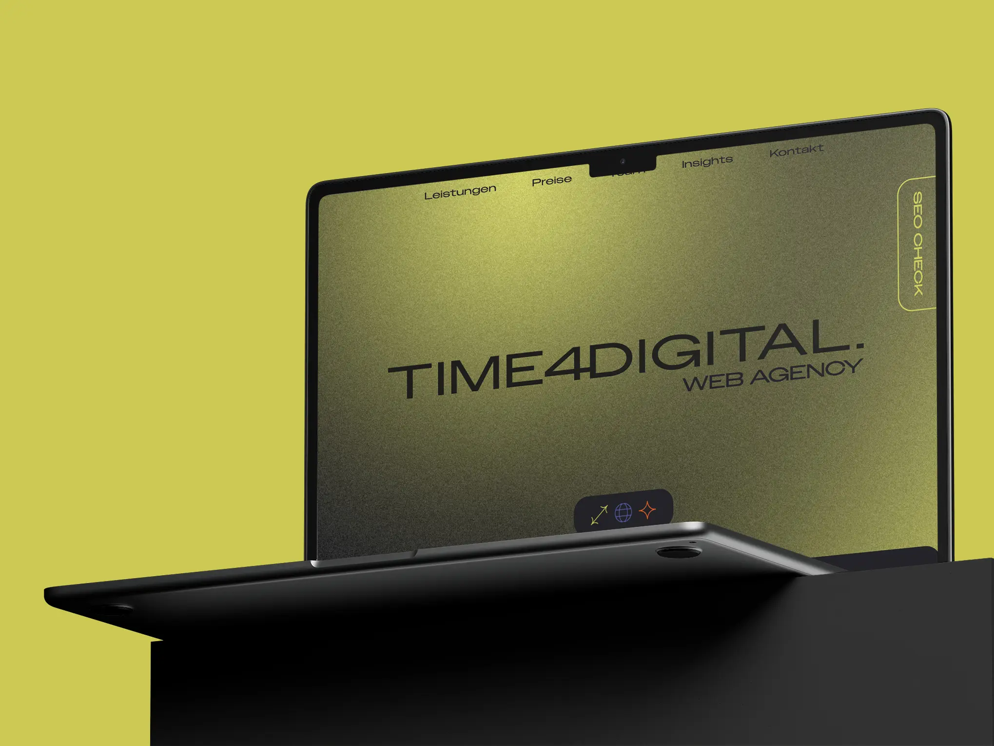
Alongside the website, time4digital’s visual identity has also undergone a fundamental transformation. What started as a simple, understated wordmark has evolved into an identity with a clear attitude – expressed through typography, colour and imagery. The goal was not only to embody what we stand for digitally, but also visually: clarity, trust and a modern understanding of ourselves as an agency.

At the heart of the new identity is the redesigned logo. Instead of the previous, rather understated lowercase wordmark, we now use a bold, geometrically shaped display typeface in uppercase – reduced, clear and distinctive. The deliberately placed dot at the end of “TIME4DIGITAL.” brings the idea literally to the point: it’s time to go digital – to have your own website, build an online presence and take the next step. With or without us – ideally, of course, with us.
Our colour palette has also received an update. A warm olive/lime green is now the main colour of our identity, often set against a background with a subtle grain texture. This gives the brand a grounded yet modern studio character rather than a sterile corporate or institutional feel. Blue and orange, which were already part of our corporate design, remain as accent colours – with slightly refined shades – and continue to appear selectively across our merchandise, online presence and symbol set.
Another key element of the new branding is the three guiding themes Strategy, Synergy and Creativity, which run throughout the new website and our communication. They represent more than abstract values – they reflect us as a team. Each of the three themes represents one of our three team members and their respective role within the company: from strategic direction and team collaboration to creative execution.
